

SoEasy service
A B2B & B2C service that helps connect merchants and customers, including pre-order system, recycling system, loyalty programs
About Project
Project type
Web admin, iOS & Android app
Company
SoEasy
Time
2019 - 2021
My Role
User Research, UX UI Design, Prototyping & Testing, Iteration
This company is focusing on services to improve the quality of life for local communities. One of their famous product is a food-ordering platform that allows people to pre-order food or order at the table especially for those who work at the office and want to save time instead of waiting in queue or people who prefer to sit down first and order.
This product got much more attention and support especially during the Covid-19 period and at the same time, more and more requirements were generated on the previous version of the App.
Following is one of the processes of a new version release.
Main scope

The main focus in this scope was mainly to 1: optimize a smoother ordering flow for them based on users' feedback and 2: convert more users based on our marketing activities.
Considering the market recognition of this app, the visual style was decided to be kept from a branding perspective and also would become easier for current users to adapt.
Three rounds of testing were scheduled. We had about 3 months before the final release. And all interactions should still be kept as simple as possible to ensure that the app does not become too heavy.
Methods
& Tools
User feedback was collected from multiple customer service and marketing channels.
User data and product performance from Google Analytics, and Datastudio were used to analyze the priorities of actions.
Different tasks were sorted using Trello where developers and designers could collaborate efficiently.
Wireframe and prototype (Adobe XD, Figma) were produced in both low-fidelity for early research and high-fidelity for the final hand-off.
After internal testing, there was a release with A/B testing to compare users' experience and satisfaction with new features. A force update was required afterward.
Analysis

Since one of the main goals of this optimization was to create a better way of shopping, most research was usability studies to understand users' natural behavior and measure the current product. Most information came from customer feedback. We have conducted interviews, and focus groups, and set an obligatory category for users to choose when they ask for help or make a complaint.
To make it more organized and systematic, we split this release based on two goals: optimization + new features. For the optimization, we divided it into three parts: Pre-purchase flow, purchase flow, and post-purchase flow. And we didn’t count temporary technical issues that were reported by users.

Most feedback was towards the pre-purchase experience - a very crucial part that influences users' willingness to place an order and their retention rate. The next part was about purchase flow that most cases were related to their orders and requests.
Pre-purchase flow
Prototype

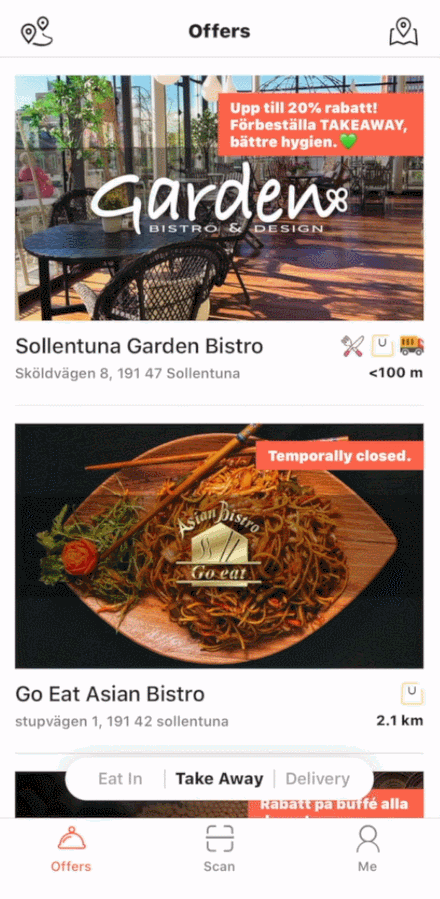
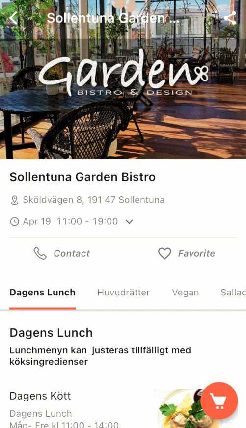
1. Browsing page of one merchant
There were some most frequently asked questions about one merchant but they were not well displayed and were arranged well. Users were not able to find it easily and would just leave the page.
We changed the layout of the main page for a merchant. We added some more information about restaurants with an accordion so it was easy to find but also didn't look overloaded. We made contact buttons more obvious to enhance one of this product’s advantages: both users and restaurants can contact each other directly.
2. Item display
Previously when users chose one dish it would generate a new page and it required more clicks from users. Another feedback we got was that users sometimes wouldn't notice a dish is only served during a period and would get confused about not being able to place an order.
We made all items stay on the same page but were expandable to get a bigger image and more info. This helped users to quickly check through the whole menu and make quick comparisons. We also added available time for each item (or category) close to the label. We still wanted to display unavailable items instead of hiding them was to allow customers to know what more they could try next time.
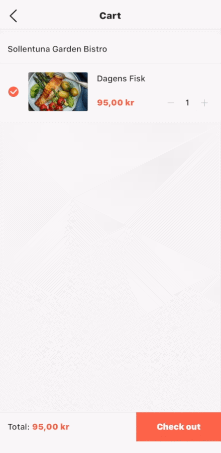
3. Adding items
The previous “buy now” button which allowed people to go to the checkout page immediately actually created some confusion that users didn't feel it's very necessary to keep both this and “add to cart”.
We only kept one “adding” icon without any text to make it simple, and recognizable and save much space for presenting the menu. We also made one shopping cart icon in the down-right corner which was easy to reach but would not distract them based on reading habits.
Purchase flow
Prototype
+
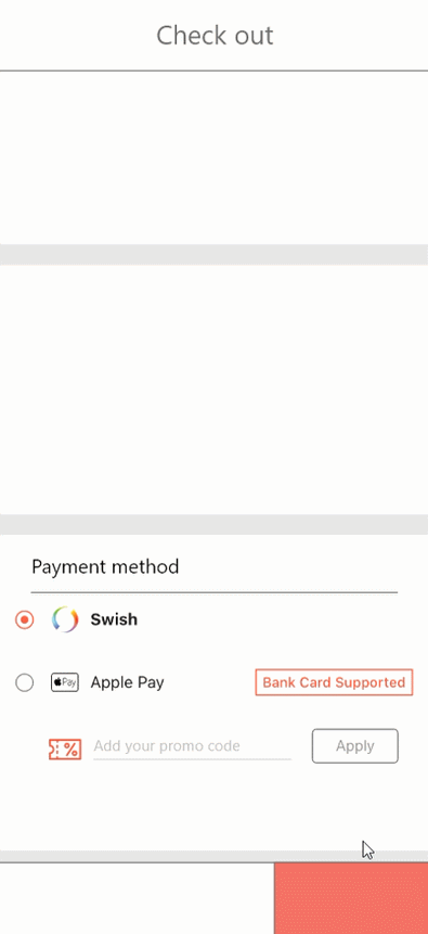
1. Layout
In the previous version, users always missed where they could write notes to merchants because it was at the bottom. And we were planning to add more different sections on this page so we had to redesign the layout.
We optimized the place of different sections on the checkout page, for example, we moved “special requests” to a higher place, just beneath the orders, and grouped them into one part since most cases their requirements are related to their orders.
2. Coupon system
🆕
We also need to implement a new feature - a coupon system. As we decided, we wanted to keep everything simple so we tried to minimize the flow of coupon redeem with understandable elements. We grouped it with payment methods.


Post-purchase flow


Re-order feature
🆕
We have noticed that some of the support asked from users was because of payment failure. Based on investigations, it seems that it couldn’t be solved by the app’s end due to unstableness from other payment platforms, we redesigned the order page so users could re-order their failed orders. It would redirect them to a new checkout page containing the same dishes from this order.
Testing &
Iteration
There were two big rounds of testings with main stakeholders and among users. The result in general was promising.
After a final evaluation based on the business strategy, we decided to move “coupon” as a separate part from “payment methods” because we wanted to make this new feature get more attention and become more efficient for users considering more marketing campaigns would be held soon.
New release
✔️
More info w/ ease and speed
✔️
Smoother checkout process
✔️
New features meet business goals
Result & Evaluation

We got quite a lot of good feedback from users and the number of total orders had a sharp increase after this release and was growing steadily.
After the release, the user retention rate had 0.1% growth in one week. After one month, the active user number got a 7.8% boost.🚀
To summarize this process, we cooperated well with different stakeholders and across different teams. There was still a lot to be discussed and optimized but we found a way to balance business goals and user needs.